Framing the future
Adelaide Film Festival

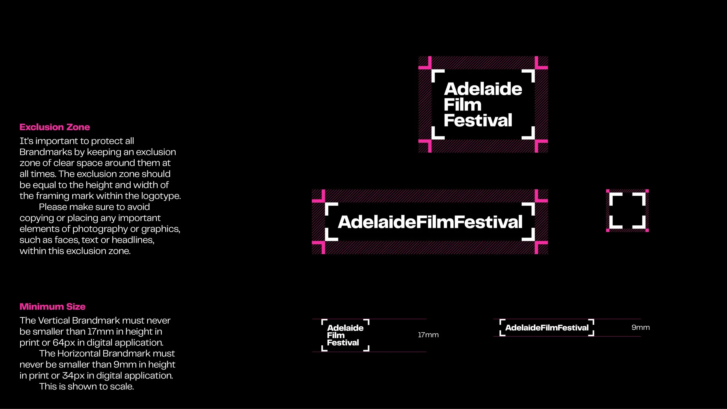
Since 2015, the Adelaide Film Festival (AFF) has stood apart with a brandmark inspired by a camera’s viewfinder—symbolising a curated lens on the world of screen art. When we were invited to refresh the identity in 2019, the path forward was clear: evolve the framing marks, don’t replace them.
Our strategy began with a comparison analysis. Amid a sea of festivals, the AFF’s framing marks were a rare, recognisable asset. Rather than starting from scratch, we leaned into this distinction—modernising the elements that mattered while preserving their emotional and visual familiarity.
The updated identity was designed to grow with the festival. Since 2022, AFF has become an annual event, expanding its reach through a film club, youth initiatives, and support for emerging talent. The brand needed to stretch across new platforms, formats, and audiences—without losing what made it resonate.
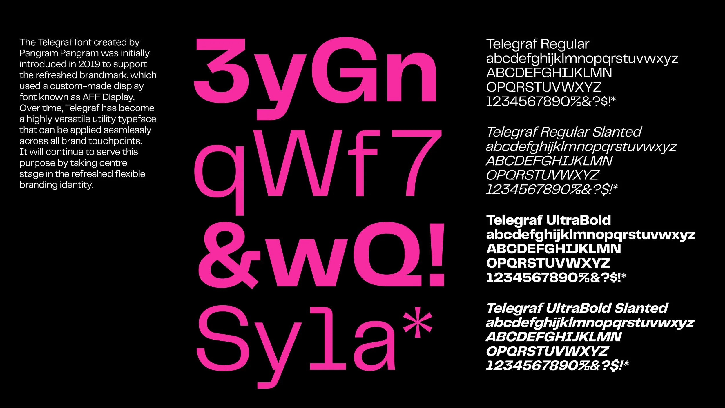
We refined colour, typography, and layout systems to bring clarity and cohesion, while keeping the experience unmistakably AFF. The goal wasn’t disruption—it was continuity with momentum.
This refresh is a case for evolution over reinvention. For adapting with purpose. For trusting what’s already working—and building on it with care.
Brand identity, Brand book, Branding design

