Marking 40 years with quiet power
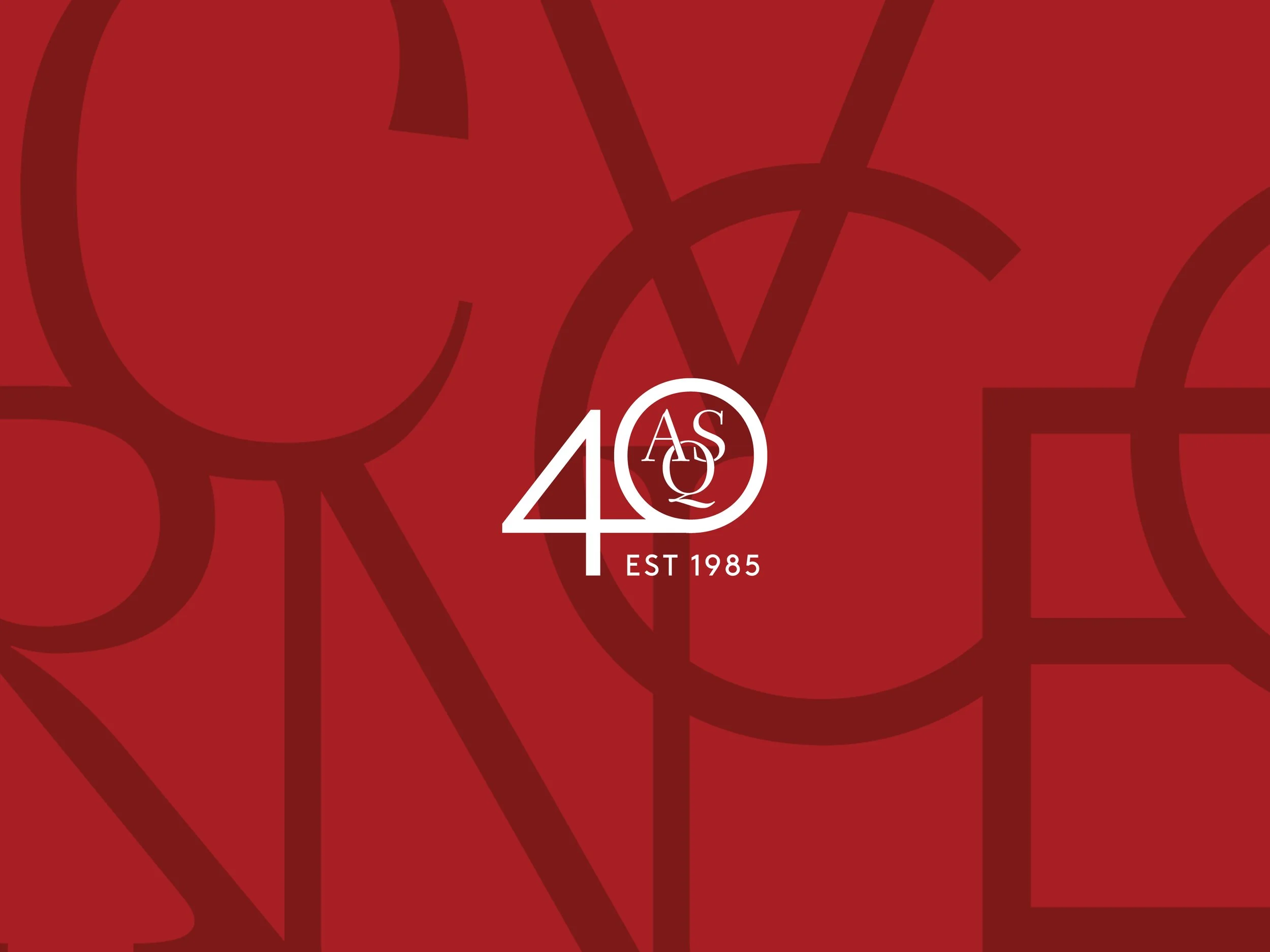
Australian String Quartet
This identity and campaign weren’t designed to be seen. It was designed to be felt.
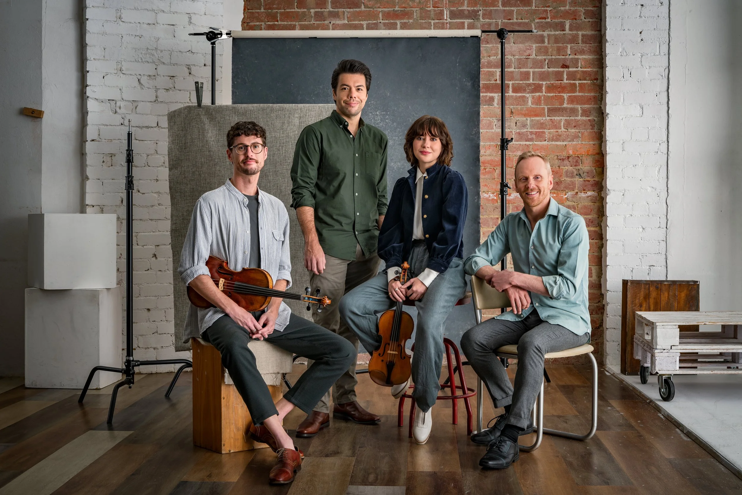
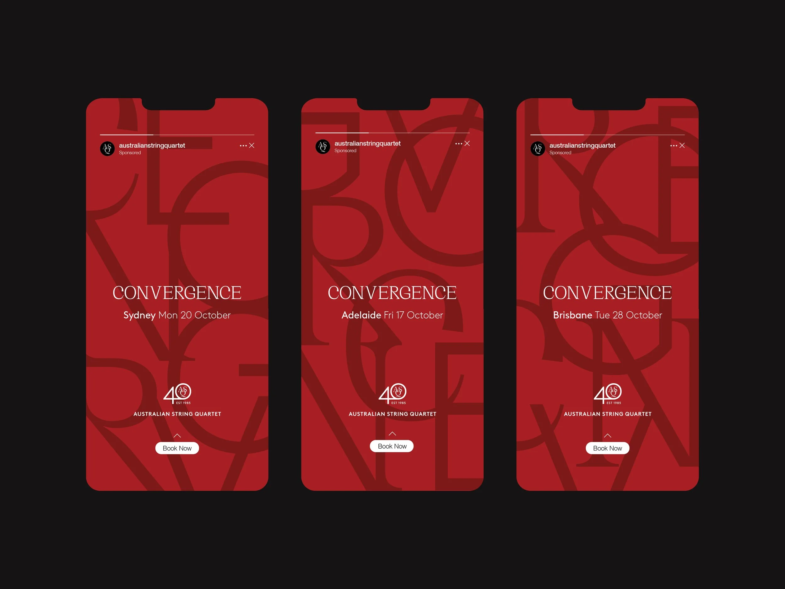
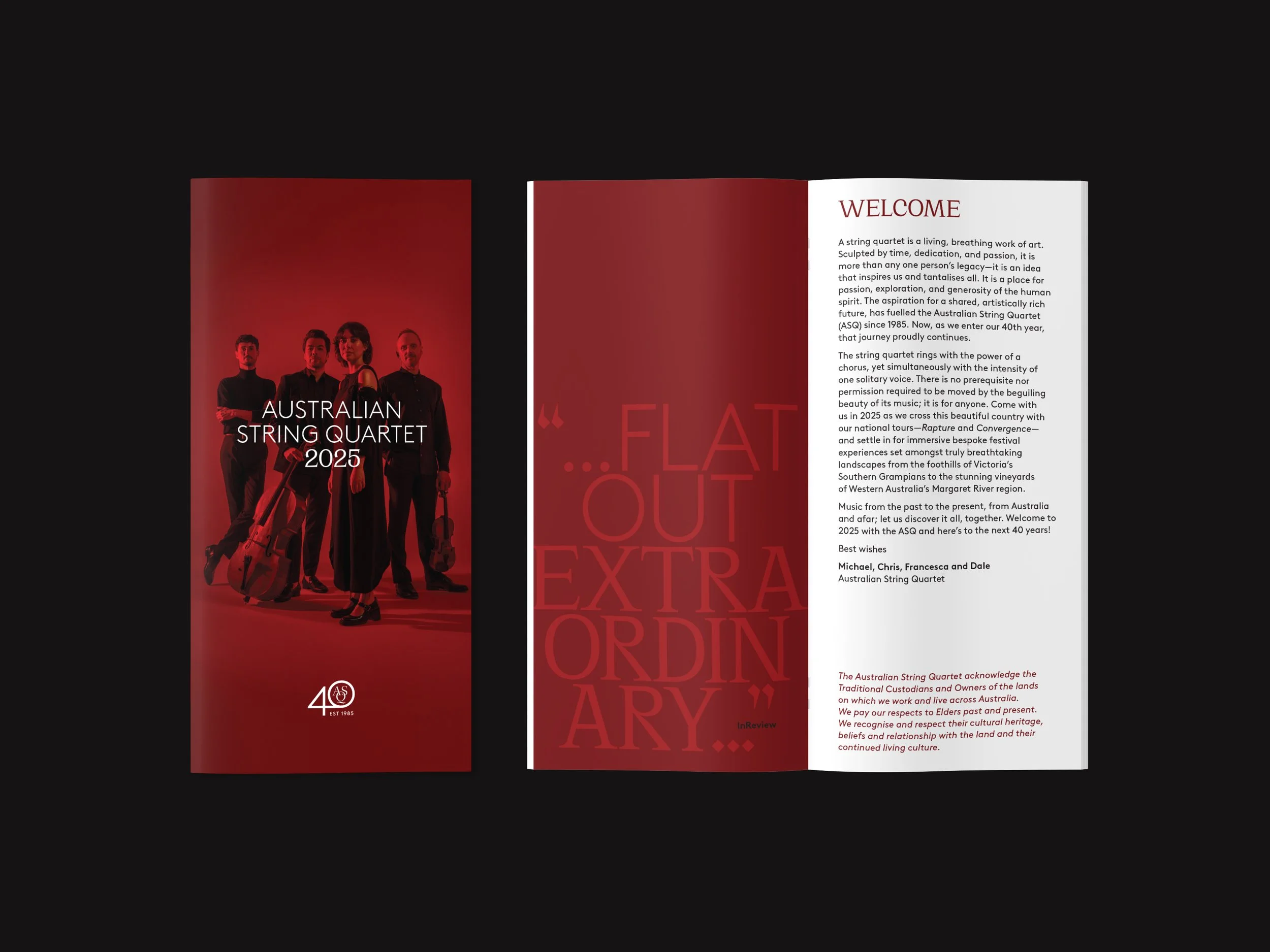
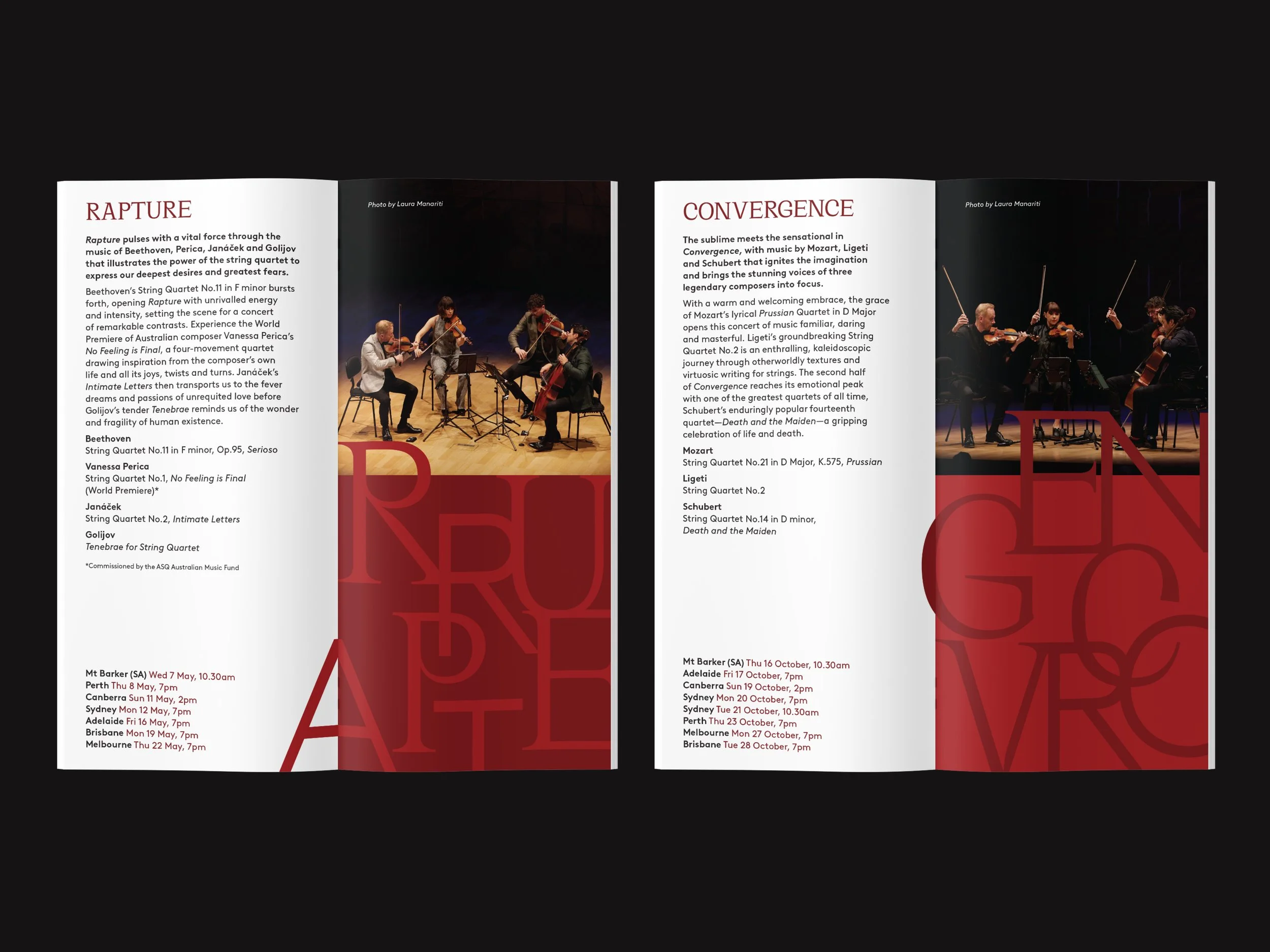
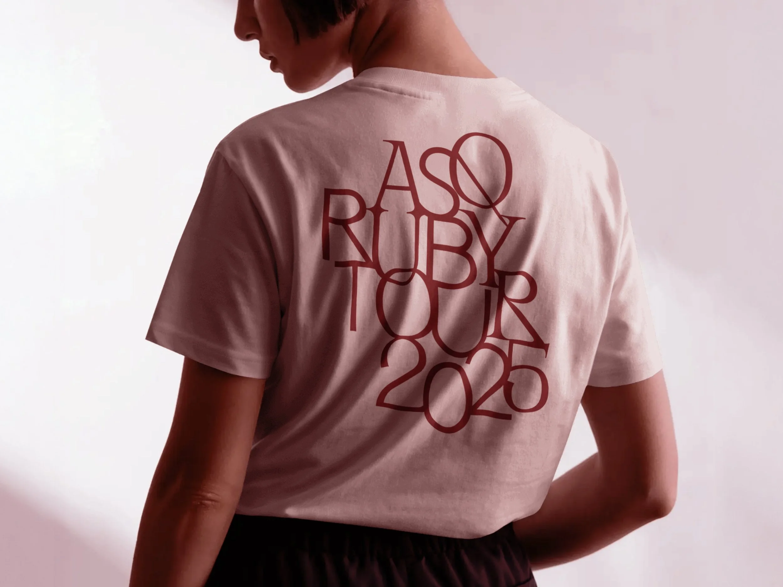
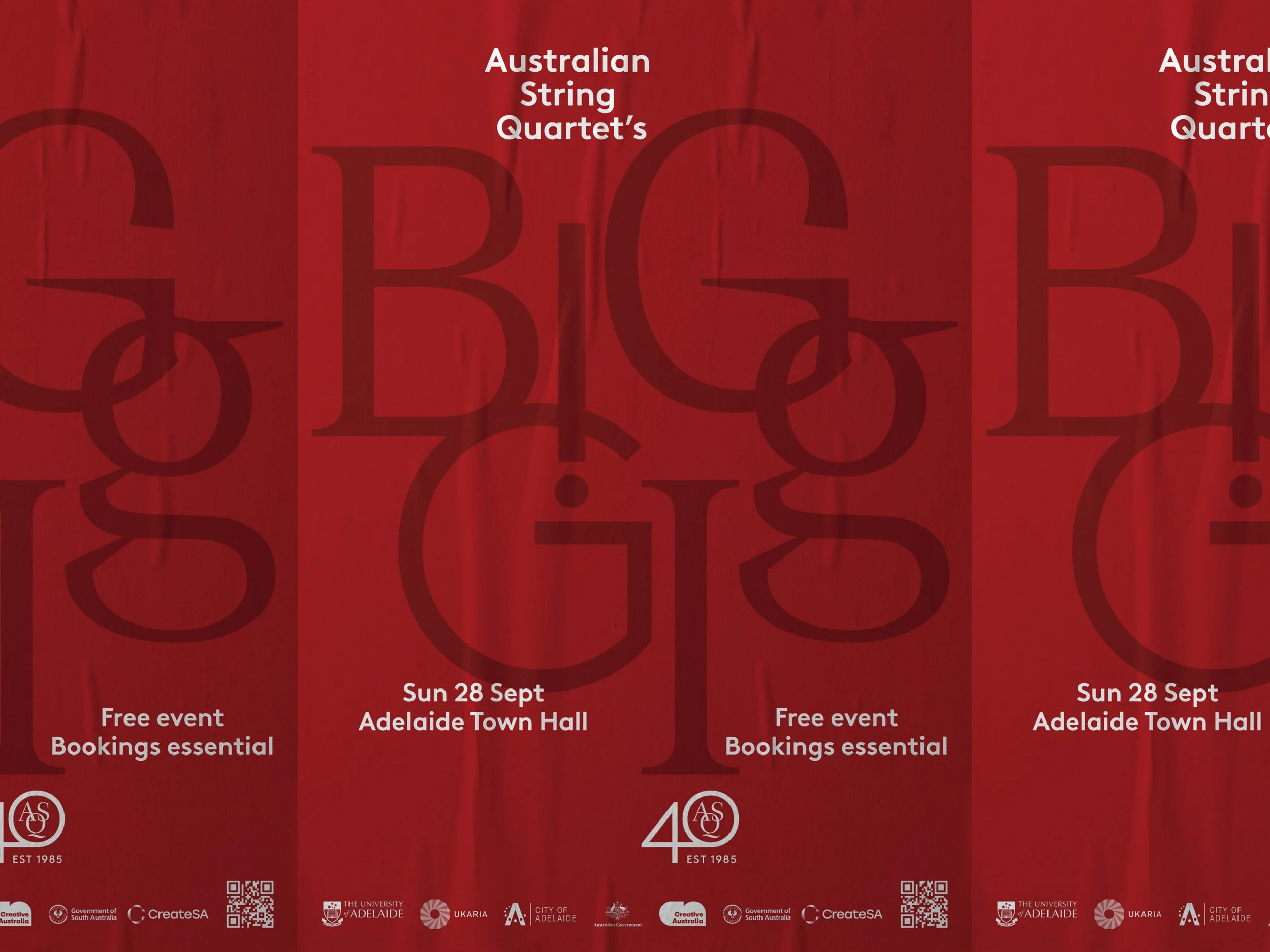
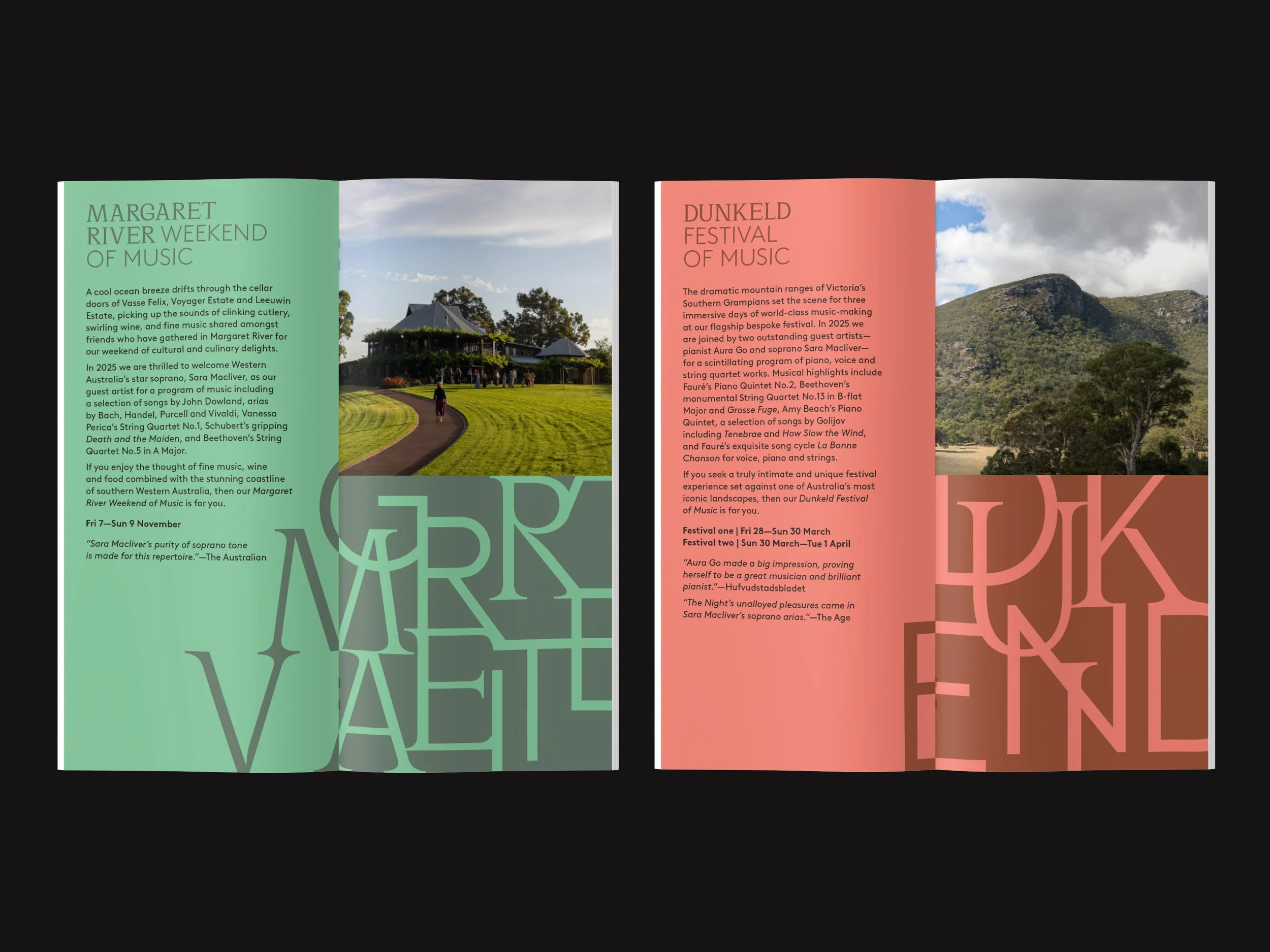
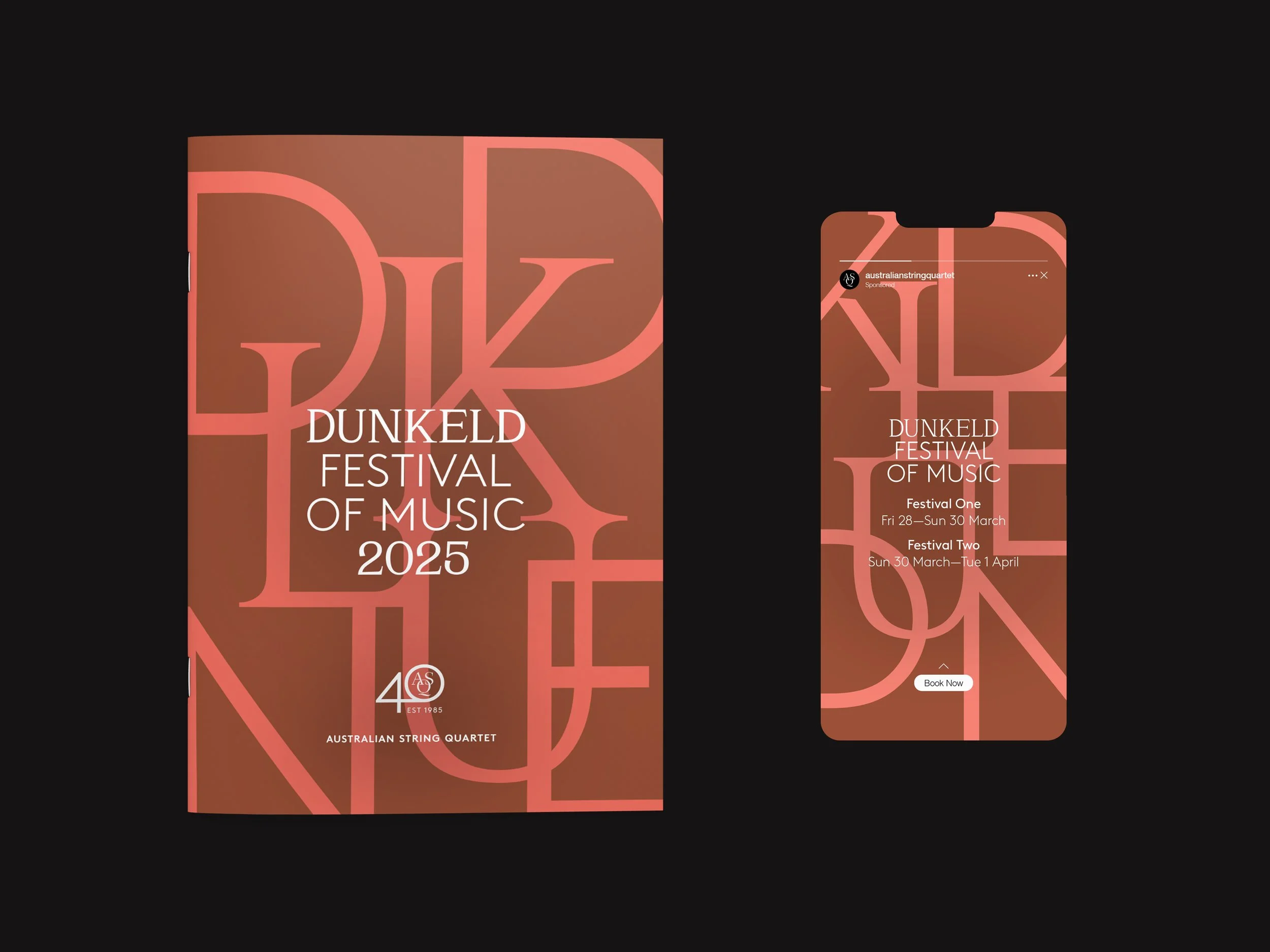
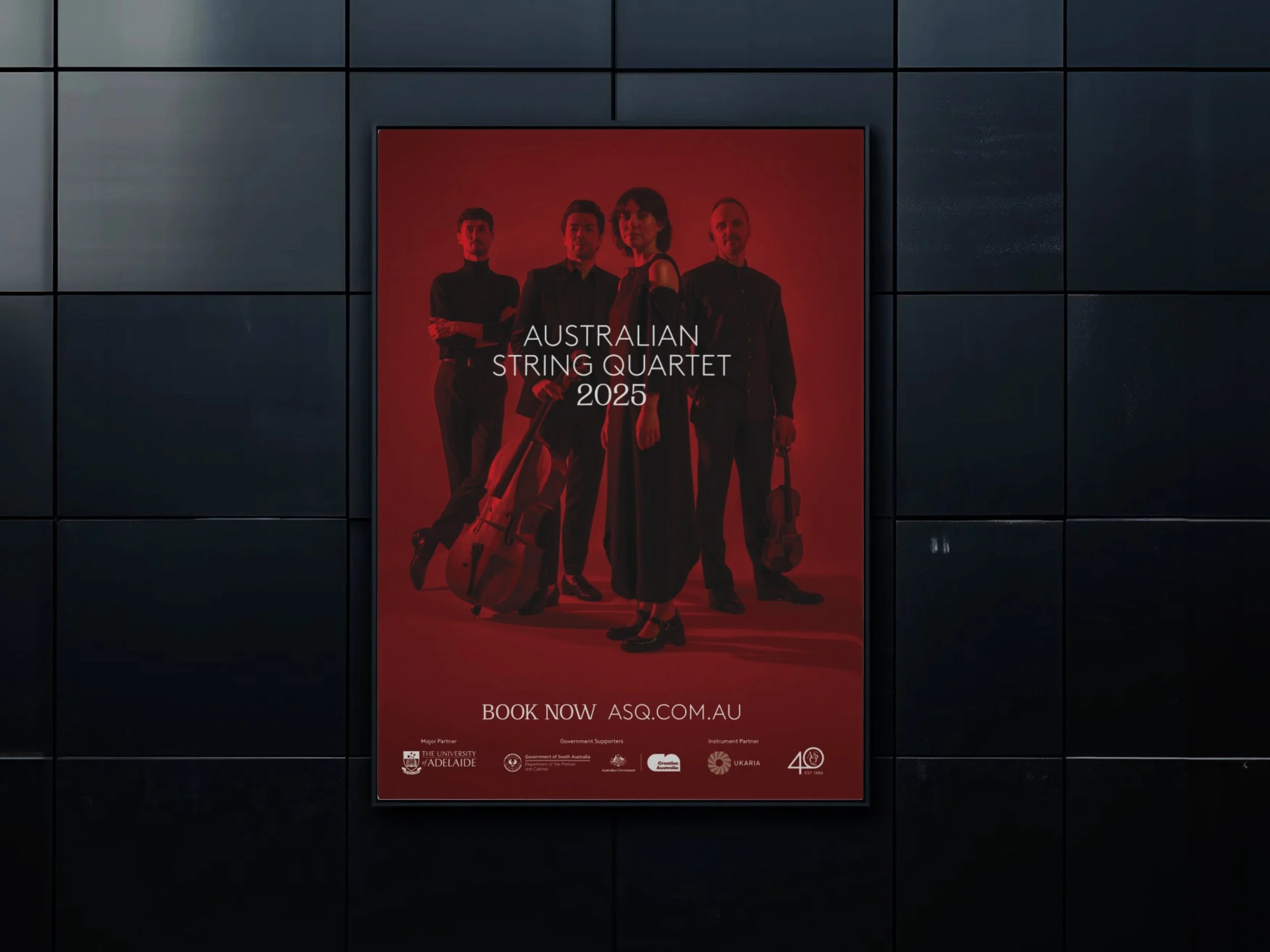
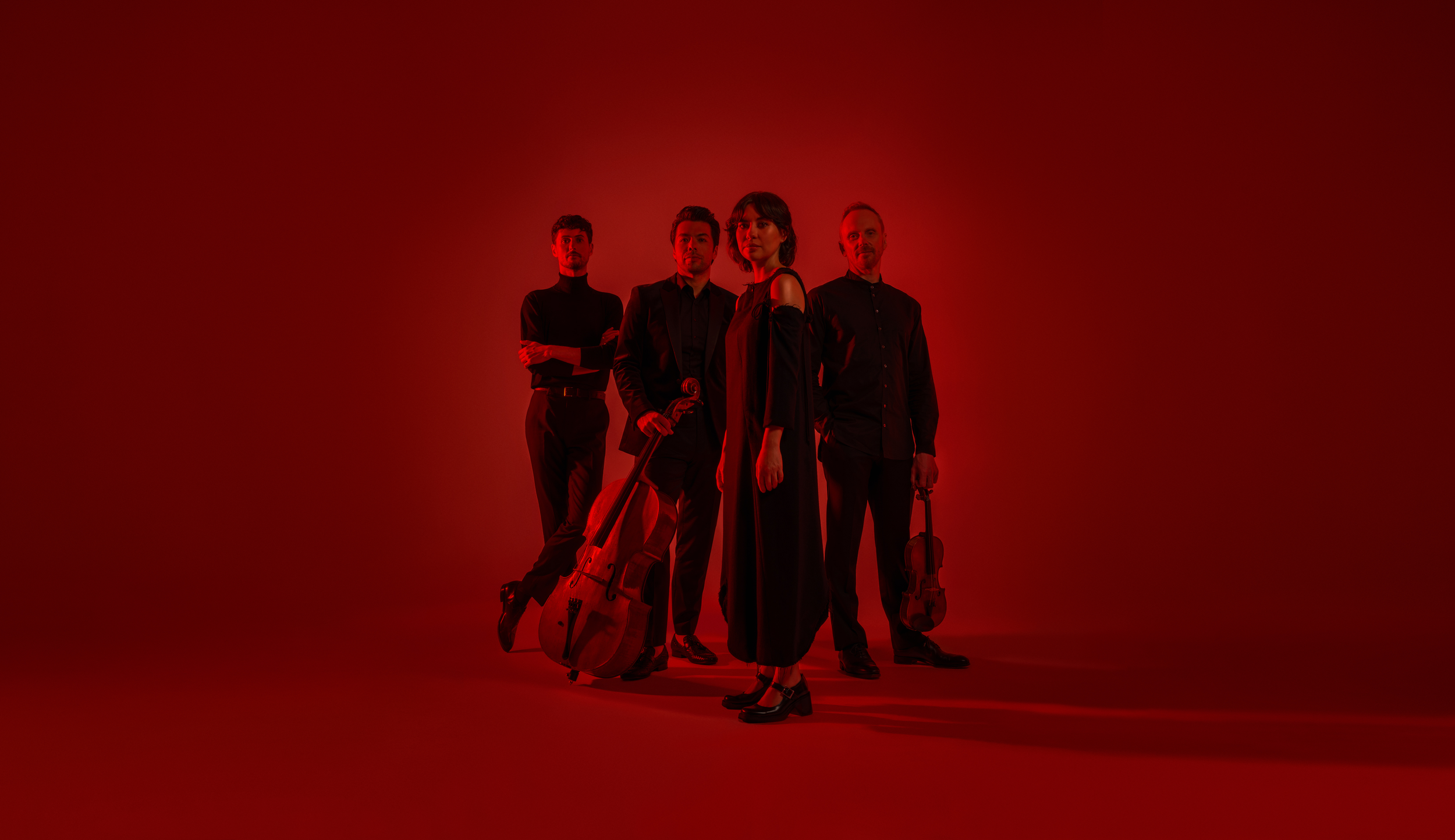
ASQ’s 40th anniversary was a moment to reflect, not just on legacy, but on presence. We built a brand system that performed: type that moved like sound, images that felt intimate, layouts that made space for breath and rhythm.
The lockup grounded the system, but the magic came from how everything worked in harmony. Portraits of the quartet gave it a face. Typography gave it tone. Nothing was loud, but everything carried intent.
It’s not a visual wrap for a milestone. It’s a sensory expression of an ensemble that’s still evolving, with clarity, depth, and grace.
Design Direction, Art Direction, Typography, Graphic Design and Production.