Essential regional connectivity
YLess4U
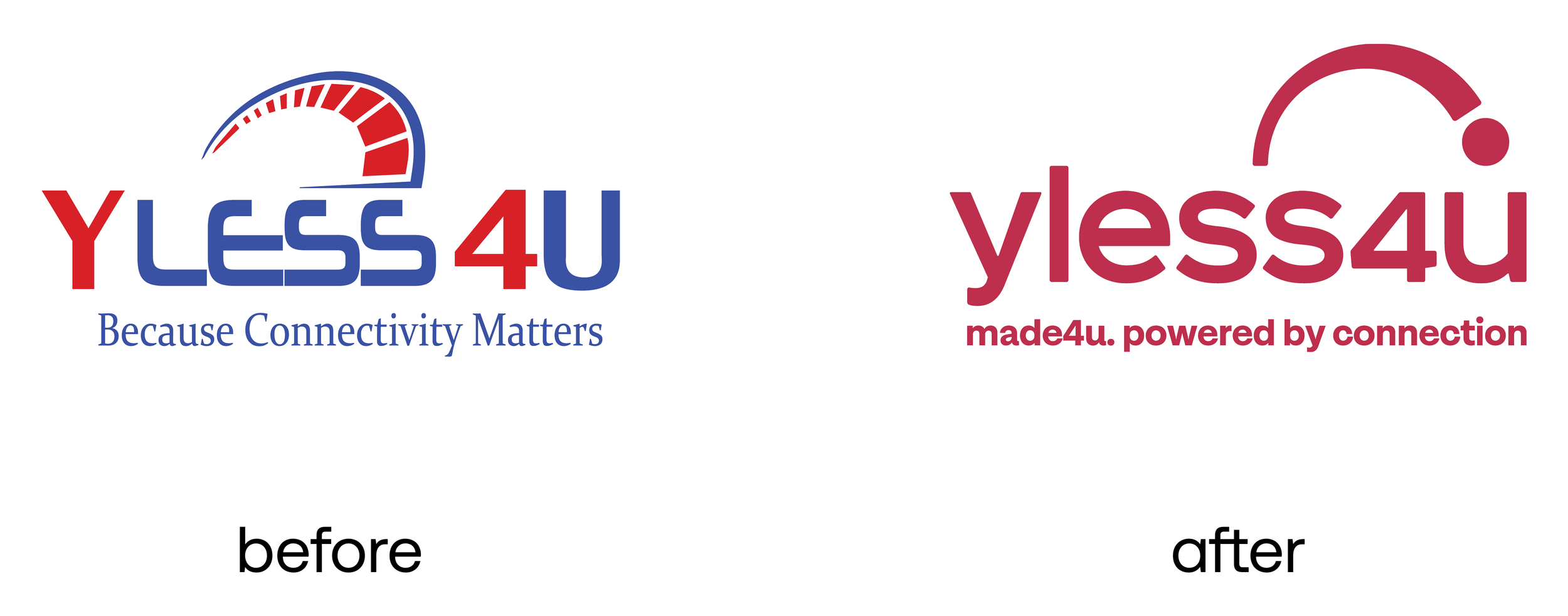
YLess4u had built a powerful network across regional Australia, but its brand hadn’t kept pace. While the service was deeply local and reliable, the identity felt dated and detached. It wasn’t reflecting the pride, resilience, or purpose that defined the team or their customers. The tone lacked warmth and relatability. Visually, it felt generic. And the core promise of connection—so critical to regional life—wasn’t being fully expressed. What YLess4u needed wasn’t just a new logo, but a refreshed identity that could hold its values and move the brand forward with confidence.
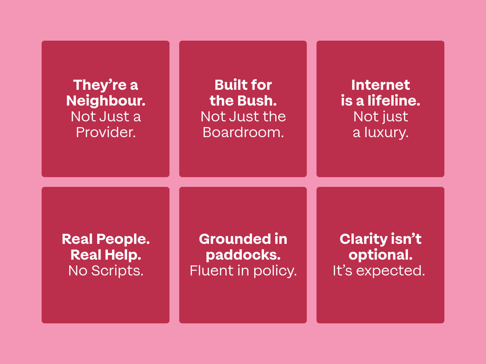
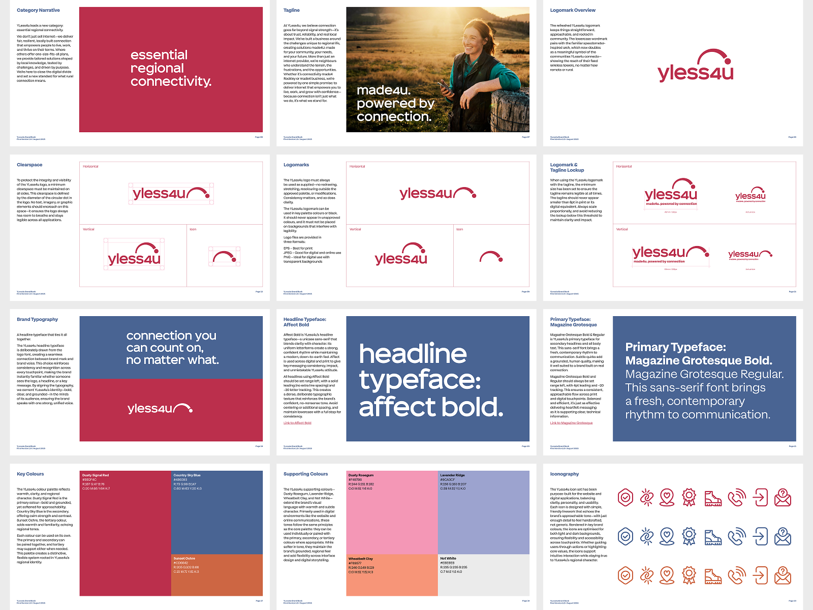
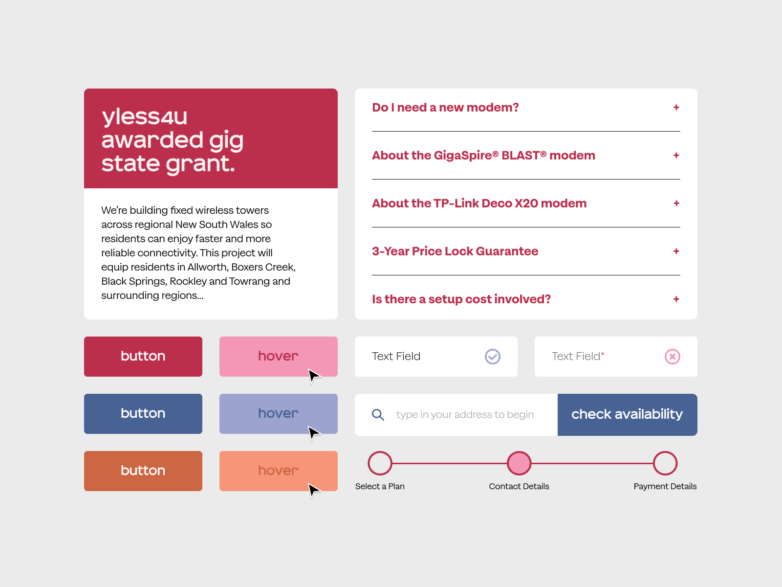
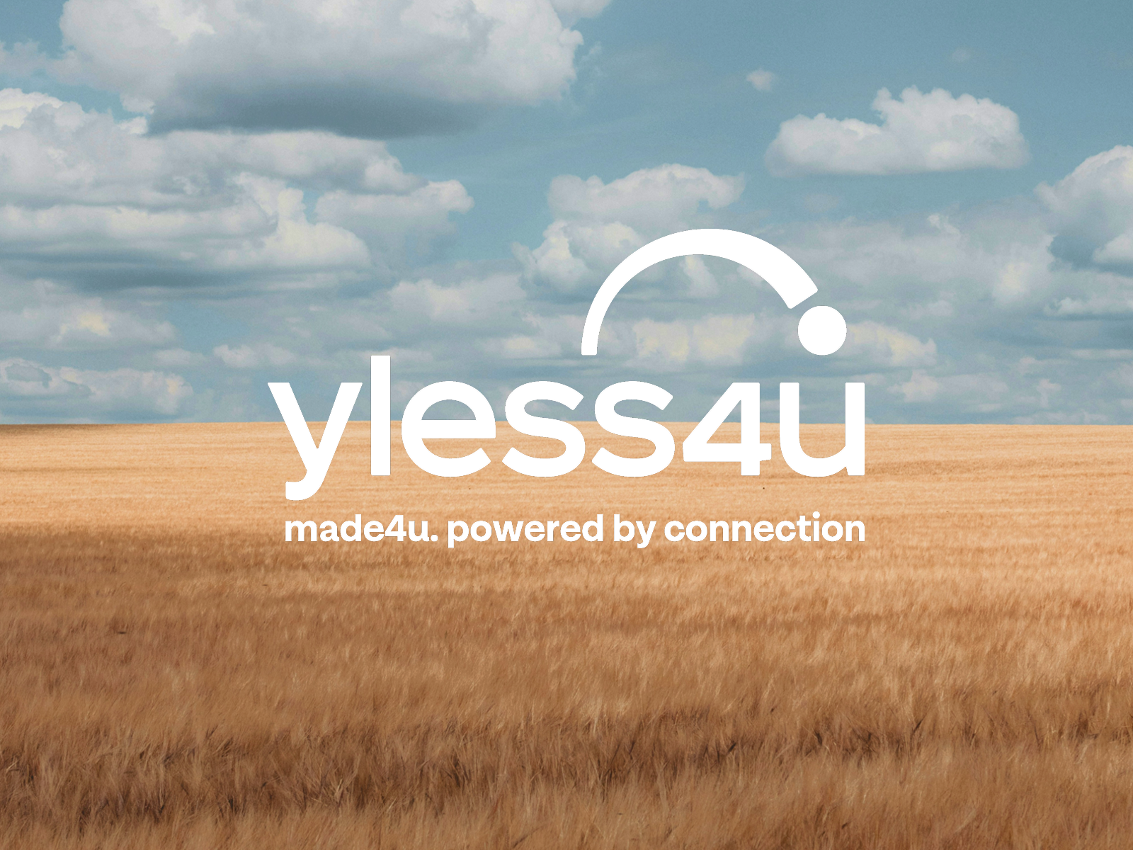
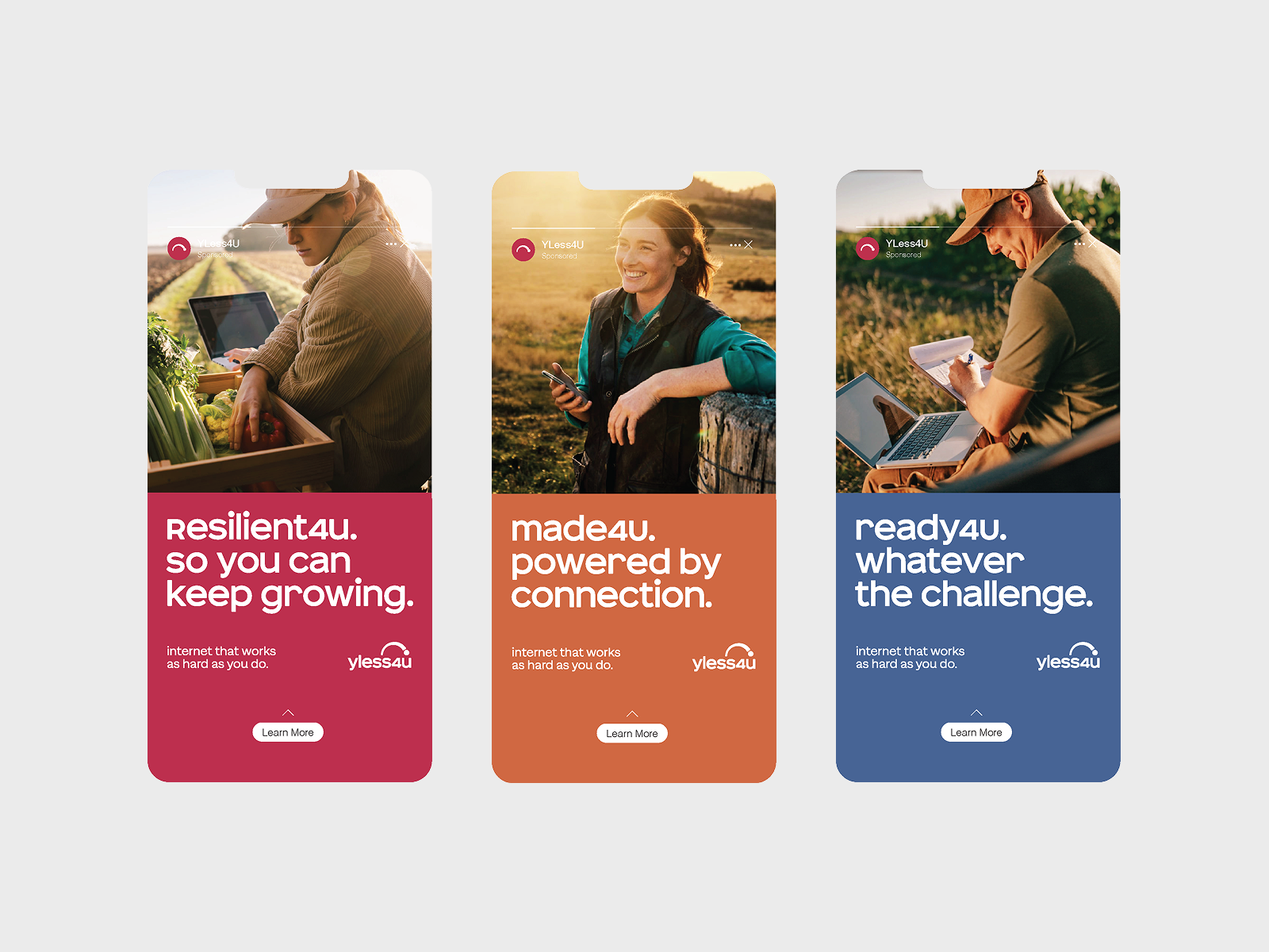
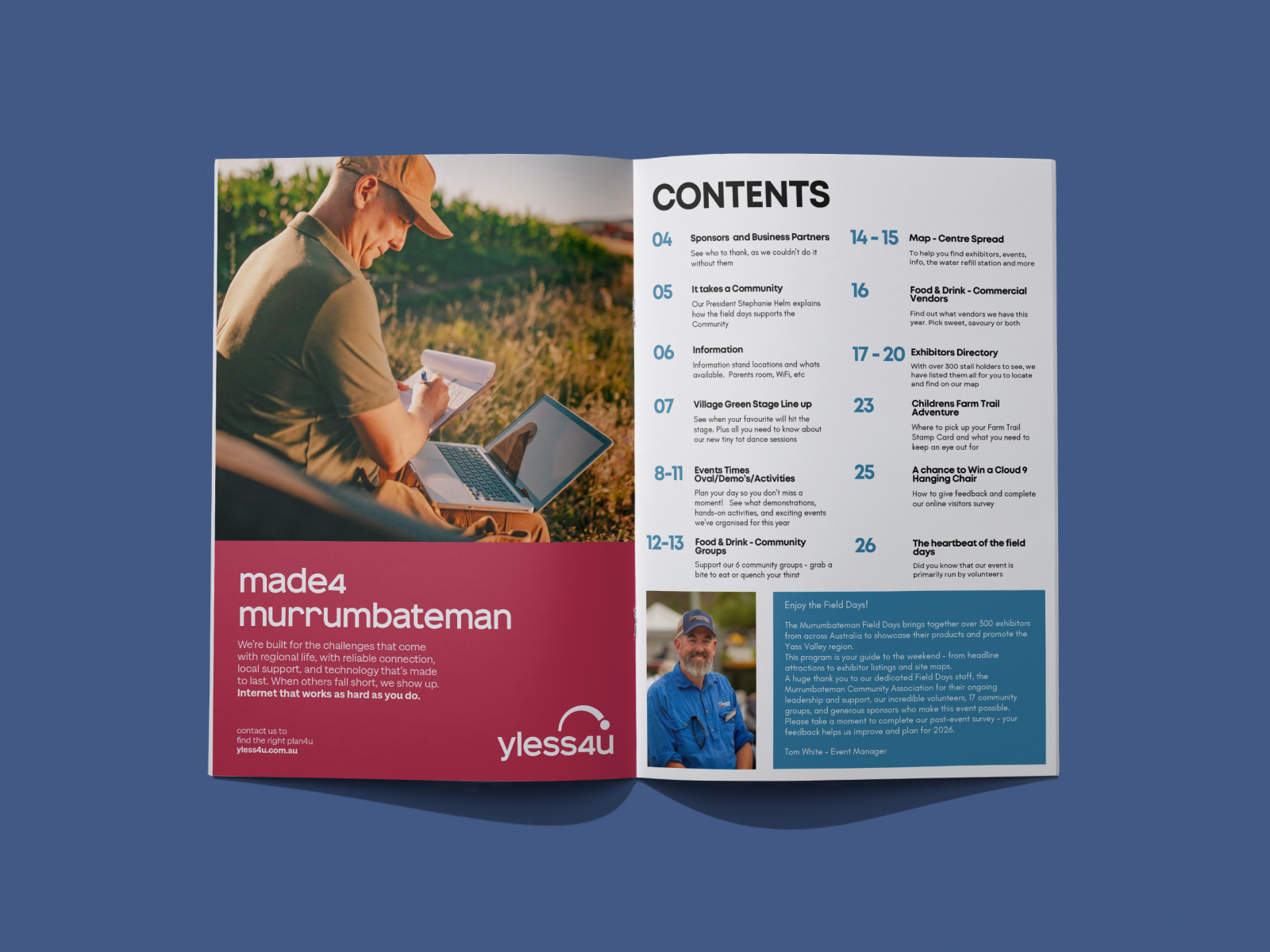
We began with conversations. Through those, it became clear this wasn’t urban internet adapted for the bush. It was something entirely different—shaped by terrain, necessity, and lived experience. We helped YLess4u define and claim a new category: essential regional connectivity. That thinking shaped everything that followed. The tone became practical, direct, and neighbourly. Visually, the brand moved to a simpler, more regional language—muted colours drawn from the landscape, documentary-style photography, and a logomark that quietly referenced signal reach. The system was designed to be flexible, allowing for both consistency and local nuance.
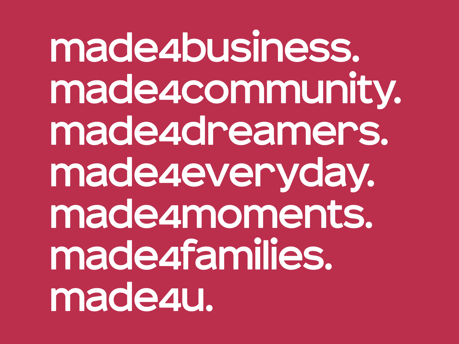
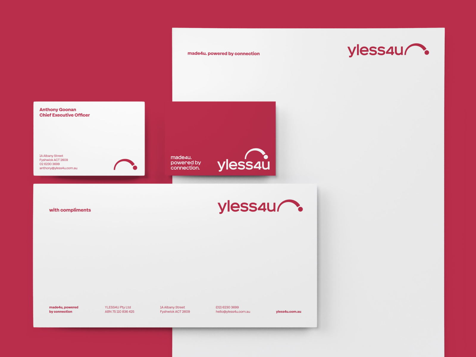
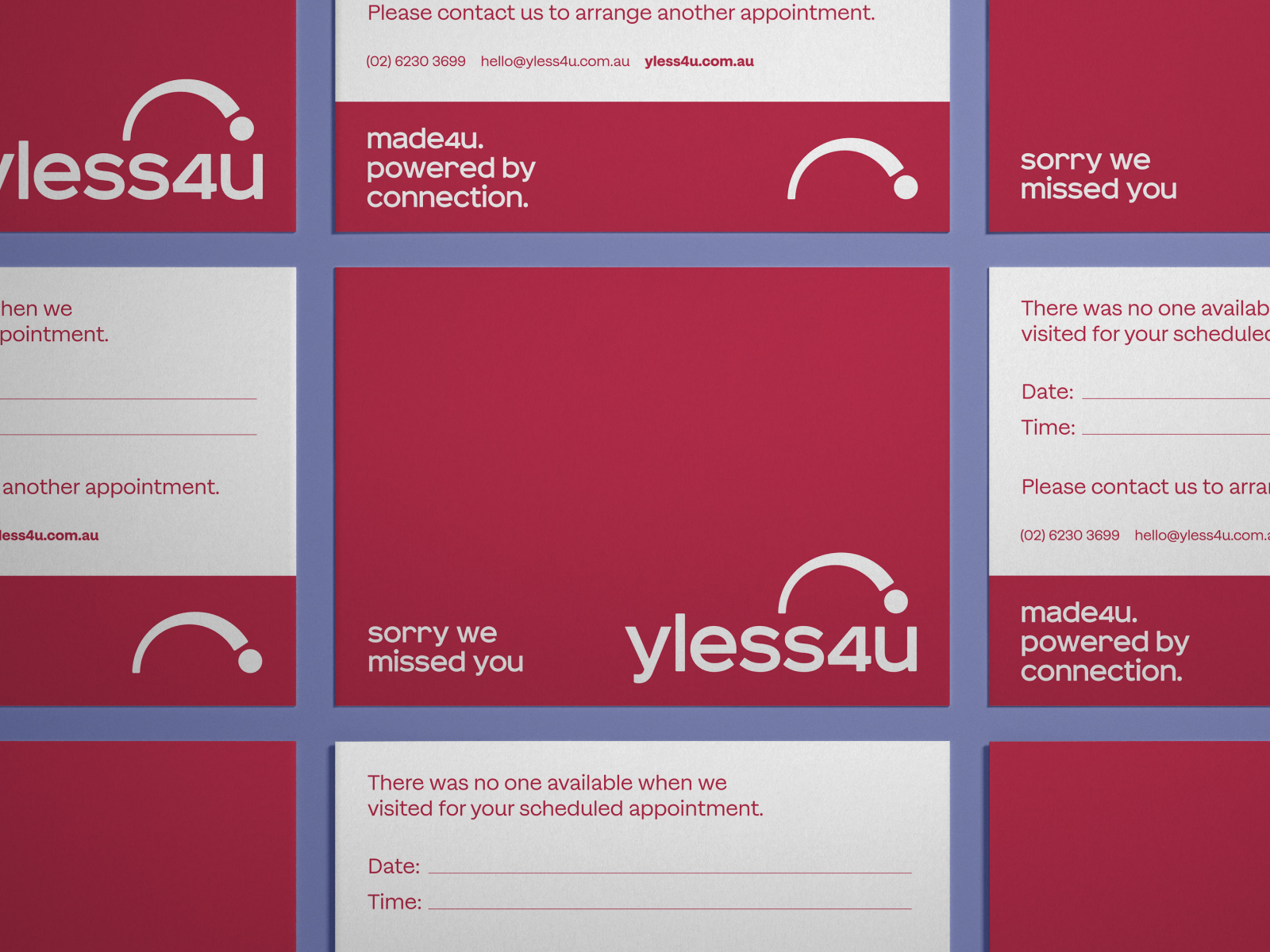
The refreshed brand gave YLess4u a platform to speak with clarity, purpose, and pride. It now shows up recognisably across every touchpoint—from livery and uniforms to digital campaigns and community flyers. The made4u positioning became a unifying thread, adaptable for local contexts while always reflecting the brand’s core promise. More than a new look, the rebrand re-centred YLess4u around its mission. It’s not just about the internet. It’s about making connections possible, wherever people live, work, and build their lives.
Brand Strategy, Design Category, Design Direction, Art Direction, Typography, Graphic Design
